

S24 series hands-on. Colours, exclusive colours and more
- CHMultimedia

- 18 janv. 2024
- 2 min de lecture
Okay, I went to see the new S24 series and loaded up on pictures of all colours, including the online exclusive: Titanium Orange, Titanium Green and Titanium Blue. They had a neat set-up where little squares demonstrated the colours:


As you can see, they seem to emulate the colour quite aptly. They had all the exclusive colours showcased that way:

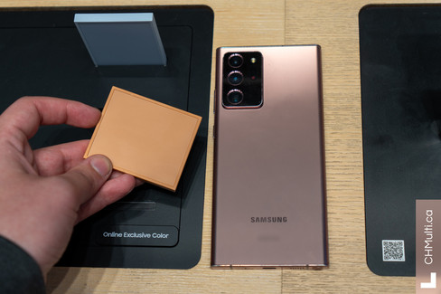


These colours look incredibly muted and flat. They don't have special shifting based on lighting. In fact, they barely behave any differently based on lighting. It's like chalk. Okay, Titanium Gray S24 Ultra versus my current Note20 Ultra, let's do this:


The colour doesn't shift as much as "Mystic Bronze", and that's a shame, but I like how it behaves. We go from Gray to Pyrite based on angle. Black isn't like before, where Samsung made a big deal of how pure black they've made the previous models. Form factor feels similar, but losing the edge screen is such an improvement. The screen is indeed brighter, and Corning Gorilla Armour's promise of reduced glare is upheld admirably. That's the clearest, easiest-to-read screen I've ever seen in a smartphone. Ergonomics are good. It doesn't feel bulkier or heavier than my phone, despite the fact that it is. Well designed. I prefer the brushed frame to the glossy frame of my device to the touch. The rear panel is still matte, and has a very soft feeling to it. I really don't hate it.


And here's purple. Nice, but nothing more. The S24/+ feel good in hand too. Some features require the download of either a database or a translation model/LLM per language, including the translation feature. Each weighs at about 400MB. I'll have to compare its performance to, say nllb200_1.3B_q8.
More on the S24 series soon.
Commentaires